The home page is the face of your site. If your home page doesn’t inspire confidence in the user or is simply inconvenient to use, you will surely get a “refuser”, and not a client.
So what should be the design of the home page of the site?
Your home page has to be informative, helpful, convenient and pleasing to the eye.
The main page is always the entry point. A person should find out what kind of company you are, what services and goods you have. And your main task is to help him with this.
On the main one you must indicate:
Who are you and what are you doing?
What do you suggest?
Why it is worth choosing you, and not any other company?
Don’t forget about convenience. Everything should be as obvious and simple as possible, but tastefully.
Header and navigation
Everything is simple here: a logo is placed here (it is also a link to the main one), a menu with links to pages. You don’t have to be too original with it. You risk confusing the user. If you make a menu with icons, provide them with a text explanation. Place “Contacts” either on the right or bottom, depending on the type of menu.
The header should indicate the main contact information: phone, address and mail. It’ll be easier for everyone: the user doesn’t have to go to the contact page to call and ask a question about a product or service.
Information Blocks.
Tell us about what you are doing – this will be the first information block. Briefly tell about your services, products and benefits.
The next item is your benefits. Be sure to place it in a separate paragraph with its own heading. For a potential customer, it’s important to understand why he should choose you, and not any other company. Try to answer this question and do it as concisely as possible.
Call to action
The design of the home page of the site should solve two problems: it draws the user’s attention to the necessary things and smoothly brings him to the purchase. Therefore, it is important to push the user to the right solution at the right time. A competent “Call-to-action” has always helps with this.
If you have only one service, then everything is obvious – you need to bring a potential customer to its purchase with the competently placed button.
If there are several services, separate them into different pages. On the home page, leave the most important – the more options the buyer has, the more likely he will get confused and won’t choose anything at all.
Footer. All contacts, links to socials, pages with vacancies, details and other things of not the first importance are placed there. In the footer, you can place an additional block with contacts, and just above make another call-to-action button – in case the user decided to study the proposal in great detail and rolled the page to the end.
Advice
Don’t put too much text on the home page, this will scare visitors away. correctly structure the text: for every description of the service should be on the heading, and paragraphs should not be too large.
Highlight your Offers
If you are making a discount on a service or product, place the information about it closer to the header. So the user will immediately appreciate the benefits and think about the purchase, even if he didn’t plan to do it.
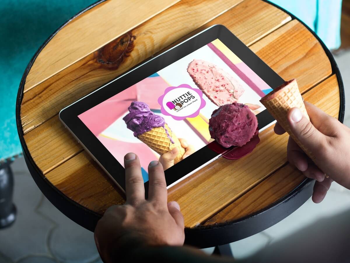
Use images
Sometimes, a well-chosen picture is worth a thousand words, because visual content is easier to perceive.
Continuously edit the page.
Test new variations of texts, calls to action and structure. Rules and tips are great, but you never know what really works. Test, experiment and monitor page performance. Move the order button to another place, change the structure of the resource header, change the layout of the product card – something simple and insignificant can have a very serious effect.
Summary
The design of the home page is important. If it doesn’t look good or is inconvenient for the user, he will not linger on the site and moreover will not buy anything. Therefore, you shouldn’t reinvent the wheel – sometimes familiar things work best. A template site is also not worth doing, but you need to be careful with experimentation. Make the structure familiar to the user, fill the page with useful information and add something from yourself – the recipe is universal and leaves a lot of space for creativity.