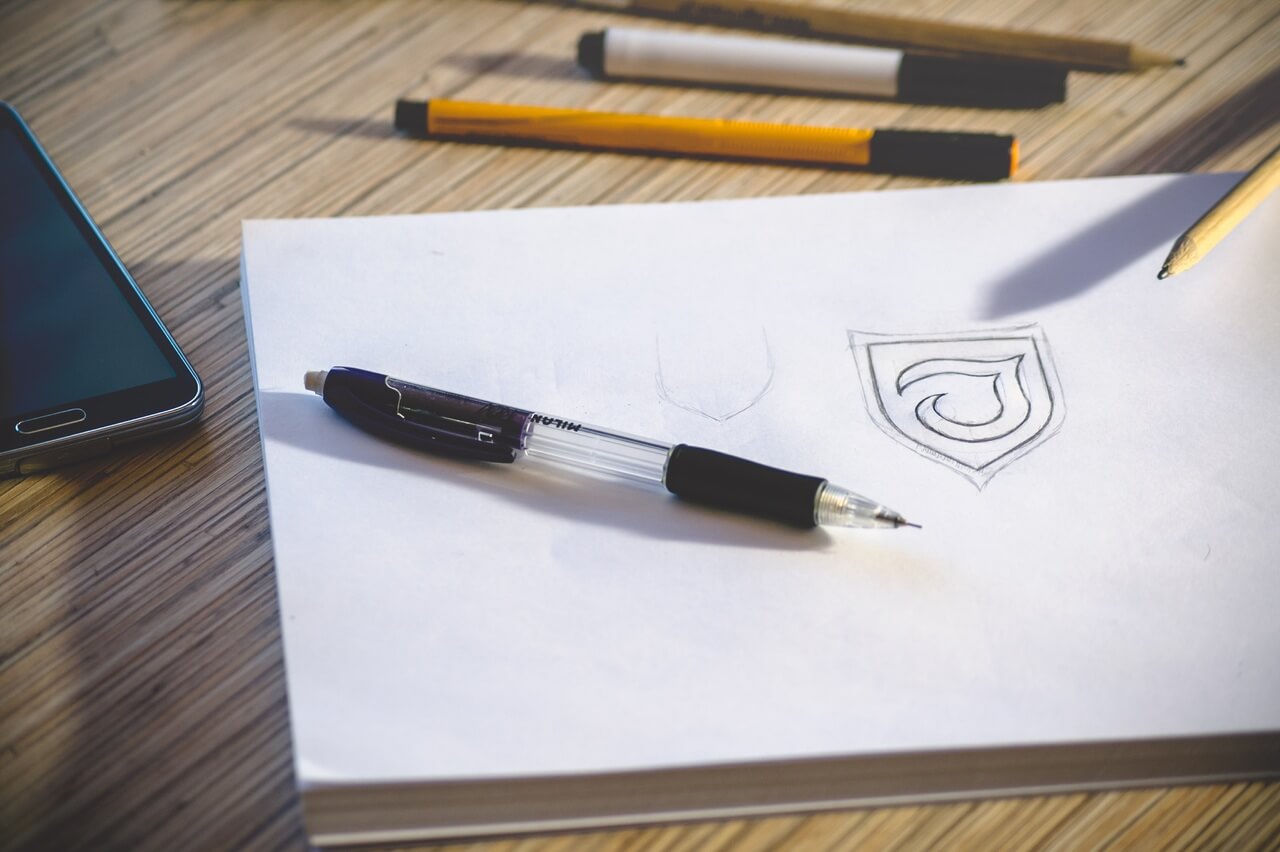
Need a new logo? Regardless of whether you start from scratch or just plan to refine the current logo, understanding the logo design trends will help you correctly set the task for the designer.
The main thing in this matter is to create something simple and distinctive in order to stand out from the competition.
Here are some logo design trends for 2020 and how you can make them work for you.
1. Simplified logos
All major brands do this. And then the biggest trends begin to spin up.
There is a transition to simplifying logos with easy-to-understand fonts with clean lines and simple images. And sometimes no images at all.
Often these logos are an evolution of previous versions, which leads to some simplification, however, new projects can also start with a simple outline.
2. Gradients
It seems that we simply cannot get enough gradients in design projects. And logo design trends are no exception.
Like the trend above, this is another place where major brands use gradient options in their logos. And while pink, purple, and orange are an indispensable part of this trend, it is a common colour palette.
What’s good about gradients is that they add depth to the image. However, this can be a bit of a challenge in logo design due to size differences when using the logo. The selected gradient should look good on large sizes – such as billboards, and on small sizes – such as mobile app icons.
3. Animated logos
Animated logos are starting to become more and more popular on sites. Many brands animate existing logos or create new, trendy animated options.
What’s great about the animated logo is that it makes you look. Think of standard website templates: the logo is often located in the upper left corner. Do you even look at him?
Animated logos destroy the monotony of this design model with its movement, which almost makes you look at the logo. It’s pretty smart if you think carefully.
4. Squares
Shaping is natural. With so many round logos – thanks to the shape of the icons on social networks – more and more logos have different square shapes.
The square also fits into the round logo, but it looks different. This is a subtle change that a brand or logo can highlight.
Most designers use squares in such a way as to fold elements such as a square icon or brand with typography next to or above it, which creates a more rectangular shape.
5. Clean lines
Clean lines and geometric patterns can create classic logos that work almost anywhere. There is great flexibility in this trending style, and this is one of the reasons for its popularity.
Clean lines give this logo option a classic look. These logos are simple and elegant, and the concept can also be combined with other design trends. Just look at the Instagram logo, it has gradients and clear lines.
6. Small serif typeface logos
A logo does not have to be complicated to be elegant and effective. More and more brands are turning to small serif logos to portray who they are.
When we talk about small serifs, we are not talking about font size, but about the size of the strokes used in the font family. This trend is illustrated by symbols that include tiny serifs. They are simple, light and practically do not recede into the background of the inscription.
These serifs can be sharp or rounded, and, as with any other logo, they affect the brand’s attitude towards users.
7. Overlapping elements
This is one of those design rules that you do not expect to break with small elements such as logos. But designers are breaking this rule … and it works.
From major brands such as PayPal to small studios such as Moxy and Oust, logo designs use elements that fold and overlap to create depth and visual interest. Overlapping styles are generally best suited for logos that have a simple sign or inscription and are contained in a specific part of the logo.
For example, PayPal uses an overlapping letter for its “P” icon, but the word PayPal does not use this processing.
To be continued…