Website visual design (UI) mistakes
Having dealt with the design of the site, let’s look at the site from the point of view of beauty.
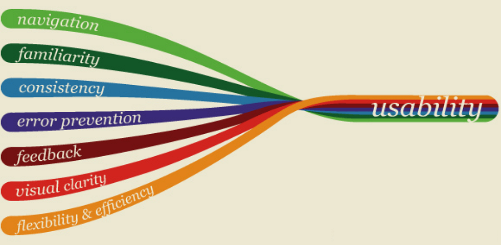
8. Visual hierarchy and accents
For a UX designer, the main thing on the site is to help in solving user problems. For a UI designer, this also becomes a priority. To do this, the designer must correctly place accents and put things in order on the page—then the user will quickly figure out where everything is and what he can do.
Sites on which the designer was carried away by pointing beauty or did not attach importance to the hierarchy are more difficult to perceive. It becomes difficult to figure out where and what is.
A good site can be read by its headlines. A bad site is one where you need to read, understand and understand.
9. Grid and alignment
Websites are built on a modular grid. If the site does not use a grid, the site looks sloppy. Maybe only designers will notice it, but most will feel it.
Neglecting the grid also makes page layouts more difficult to adapt to mobile devices.
10. Bust with decor
As we said above, an interface designer is not a decorator, not a designer. A web designer is more of an engineer who uses colour, type, and other expressive means to help the user solve their problem and the business theirs.
11. Outdated style
In web design, just like in interior design and fashion design, there are certain styles. There are conditional styles in web design too—style is like the clothes you put on the site. The same button can be designed in different styles. Style is important because it forms the impression of the site and sets the atmosphere.
12. Inconsistency/violation of style
As a separate item, we took out the lack of style. It happens that there are sites on which a certain style is not maintained, even in colours and fonts. On a site with something technologically advanced, we suddenly come across an 18th-century typeface with serifs and great contrast.
Well, you should not forget about the harmoniously selected colour scheme. Combine what is compatible and do not combine what is not. Use your signature brand colours throughout the site to maintain brand integrity.
13. Blindly Following Trends
Do you still read articles about trends every year? So are we, but you shouldn’t rely on them — trends change every year, and in business, it’s better to focus on numbers and analytics. This will most likely not give you results, but it can confuse regular site visitors.
Of the trends, it is worth taking what will benefit you, trends by themselves are useless. It is better to work on the basics: SEO optimization, usability improvement, copywriting, and content.
14. Visual noise
Visual noise is the overuse of shadows, strokes, rulers, and tints. The rule is, everything that can be removed without loss of meaning—we remove. When there is too much superfluous, we lose concentration and some information is not absorbed.
Be sure to check your site as well. If you have identified shortcomings, we recommend that you consult with our designers on a possible redesign of the site.