Web design is closely related to usability, they are inseparable. After all, design has an impact on the final perception and on the convenience of interacting with the site. It is important to use the power of design correctly and not make the mistakes that are present on many sites.
We divided the article into 2 parts, in the first part we will talk about mistakes in website design (UX), and in the second part, we will talk about visual design (UI)—everything that concerns beauty.
Website usability (UX) errors
Let’s start with the shortcomings that significantly affect the convenience for users.
1. Lack of real content
The real content on the site is more significant than it seems. Now site visitors want to see a real working business, while stock images and “fishy text”, on the contrary, are repulsive. Due to the use of such elements, there is a feeling that the site is fake and there is no business behind it.
Without real content, there is no trust. Without trust, there is no sale.
2. Ignoring Behavioural Patterns
In interface design, there is a concept—a behavioural pattern. Roughly speaking, a pattern is a familiar way to interact with an interface. An even shorter pattern is a habit.
Pay attention to the marketplaces—they seem to be all the same. They differ only in small things. It’s all about the patterns.
If users are used to using the conditional Amazon, for which similar sites invent something new, it is better to take ready-made solutions from competitors. And this is not done out of laziness: when the user sees a familiar element, he knows how to interact with it.
A website visitor clicks on a product and adds it to the cart. He knows that this product will appear in the “Cart” section. He also knows that he can remove it from there. Because he is used to this behaviour of the elements.
A good site is an understandable site.
3. No adaptability
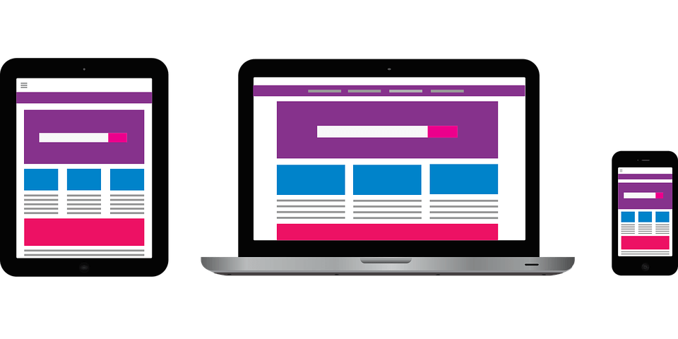
It’s already a shame to write about adaptability in 2022 :), But non-adapted sites are as common as they were 5 years ago. Now, the spread of mobile devices has reached such a scale that almost every site simply has to be displayed correctly on mobile devices.
4. Too complicated shapes
Today, forms with a bunch of fields are a thing of the past—this condition dictates time. Everything is getting even faster than it used to be, and people are trying to spend as little time as possible on solving their problems.
Do you need a taxi? No time to figure it out—tell me the cost and let’s go.
If earlier, in order to register on the site, we filled out a bunch of fields, today we log in through social networks with one click.
Therefore, try to get rid of unnecessary fields in the feedback forms as much as possible—additional data can be found later.
5. Difficult navigation
Users come to the site to solve their problems. To solve it faster, they need to quickly find their bearings, which is what smart information architecture and navigation are for. Now, with such an abundance, it is easier to find a similar product from a competitor than to try to find what you require on a complex site.
Don’t make users think—pull out everything they require in the menu.
6. Lack of calls to action
Call to action or CTA (Call to action) are website elements designed to push the user and show him where and what he can do: order a call here, download the price list there, and calculate the cost here.
Well-placed calls to action will help your site sell. No need to be shy about it, people come to a commercial site to buy something—so help them do it. It’s a concern, not a push.
7. No social proof
To buy from you, visitors must see what you are ALREADY buying. The site needs elements that show visitors that your business is working and your products and services are in demand. Many are afraid to be the first, it is easier to trust what others have already chosen for themselves.
At this point, we finish and move on to the second part of the article, which deals with visual design.

